
Why Jaguars new logo sucks
Jaguar’s new logo sparked a massive backlash, disappointing fans and fueling debate. Here’s how trend-chasing is destroying iconic brand identities.

Jaguar has unveiled their new logo, and it has back-fired spectacularly. Jaguar’s recent rebranding, marked by the unveiling of its new logo and new teaser advertisement video, is a bold attempt to modernize the brand. However, instead of celebrating its legacy, the redesign strips away the very essence of what made Jaguar an iconic name in luxury and performance, Jaguar fans around the world are not happy.
Join me as I dissect the new logo using fundamental design principles and the psychology of branding to explain why this move is a major misstep—and could hurt the brand long-term, as go over the backlash they’re receiving.
The Minimalist Logo Trend
Over the past decade, brands across industries have embraced a minimalist approach to logo design. Simplification, flat design, and clean typography have become the dominant trends, fueled by the rise of digital-first branding. The goal? To make logos adaptable, scalable, and visually streamlined for modern platforms like apps and websites.

While some brands have successfully modernized without losing their identity—think Porsche’s subtle refinements or Apple’s sleek evolution—others have faced backlash for going too far. Volkswagen, for instance, flattened its logo to embrace a digital-first aesthetic while maintaining its core look. On the other hand, the backlash against Gap’s 2010 redesign, which abandoned its iconic blue box for a generic wordmark, is a cautionary tale of stripping too much character.
Jaguar’s recent logo change is the latest entry in this trend—but instead of aligning with their brand’s essence, it feels like a complete departure. This raises an important question: how far is too far when simplifying a brand’s identity?
The Old vs. The New
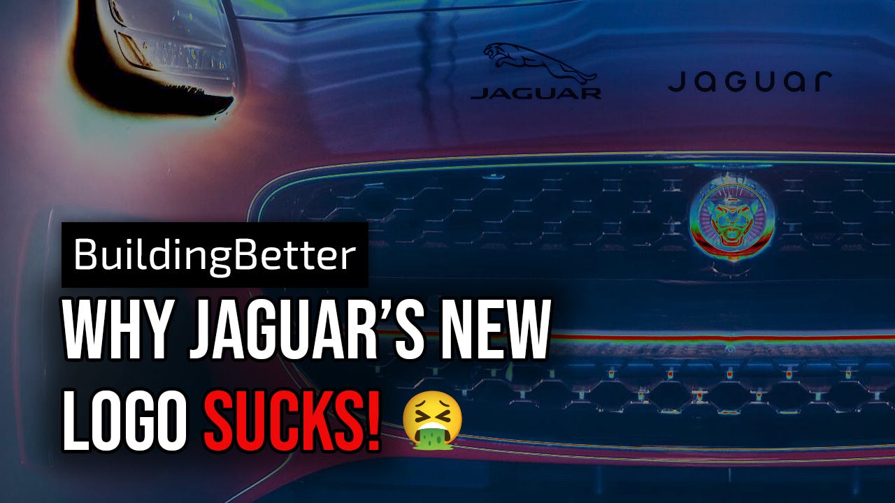
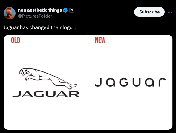
For decades, Jaguar’s logo represented power, elegance, and speed. The leaping jaguar icon, paired with sleek, sophisticated typography, captured the essence of the brand’s high-performance luxury vehicles. The new design replaces this with a minimalist, wordmark-only approach that feels cold and detached.
On the surface, this aligns with modern design trends, where simplicity is favored over complexity. But for a brand like Jaguar, this shift comes at a significant cost.
The Loss of Distinctiveness
Design Principle 1: Stand Out or Fade Away
A successful logo doesn’t just look good—it tells a story and makes a brand instantly recognizable. Jaguar’s old logo achieved this effortlessly. The leaping jaguar symbolized motion, luxury, and dominance, creating an instant connection between the logo and the product.
The new design, however, removes this iconic symbol, leaving only a minimalist typeface. While sleek, it’s generic enough to resemble countless other brands—tech startups, lifestyle companies, or even a boutique gym. When a logo loses its distinctiveness, it fails to stand out in a crowded market.
Design Principle 2: Reflect the Product
Logos aren’t just decorative—they represent the product’s qualities. The leaping jaguar embodied the speed, power, and performance of Jaguar’s vehicles. This wasn’t just a logo; it was a promise of what customers could expect.
The new design, devoid of the animal icon, breaks this connection. There’s nothing in the logo that ties it to the idea of high-performance cars or luxury. It’s an abstract wordmark that could belong to almost any industry, diluting the brand’s identity.

The Psychology of a Poor Logo
Emotional Triggers and Brand Heritage
Logos are powerful emotional triggers. The old Jaguar logo was aspirational, reminding customers of the brand’s rich history and high standards. Its visual storytelling inspired feelings of prestige and exclusivity.
By contrast, the new logo feels cold and corporate. For a luxury brand, which relies heavily on emotional connection, this detachment is a critical mistake. When you strip away the soul of a logo, you risk alienating loyal customers and reducing brand loyalty.
Cognitive Fluency: Symbols Speak Louder Than Words
Human brains process symbols faster than words. The leaping jaguar icon was an instant visual cue that conveyed the brand’s essence without requiring explanation. Removing it forces viewers to rely entirely on the text.
Unfortunately, the new typography doesn’t do enough to make up for this loss. Its minimalist design doesn’t evoke the same sense of motion, power, or prestige. This increases cognitive load and makes the logo harder to remember—a dangerous move for any brand.
The Perception of Quality
Luxury branding is as much about perception as it is about product quality. Jaguar’s old logo conveyed tradition, sophistication, and performance. The new logo, with its stripped-down design, feels lifeless and detached from the brand’s heritage.
This detachment diminishes perceived value. Customers associate premium brands with rich storytelling and visual identity. A generic logo suggests a lack of care and erodes trust in the brand’s commitment to excellence.

Chasing Trends at the Expense of Legacy
The new Jaguar logo is a textbook example of trend-chasing gone wrong. Minimalism might be fashionable, but it’s not inherently suited to every brand. Jaguar isn’t a young tech company; it’s a storied name in the automotive industry, steeped in tradition and prestige. The attempt to modernize its identity feels like an erasure of its history.
Other luxury brands have modernized while maintaining their core identity. Porsche, for instance, updated its logo in 2023 by refining details, not discarding them. It’s possible to embrace modernity without losing heritage—but Jaguar has failed to strike this balance.
The backlash
The reaction to Jaguar's new logo has been swift and overwhelmingly negative. Fans and industry experts alike have criticized the design for abandoning the brand's iconic leaping jaguar and opting for a minimalist wordmark that feels generic and uninspired.

Common complaints include the lack of character, the logo's resemblance to unrelated industries, and the erosion of Jaguar’s heritage and prestige.
Some have gone as far as calling it a "childish downgrade" and a "self-destruct button" for the brand. The overwhelming sentiment is that the new design prioritizes trendiness over timelessness, alienating loyal customers who connected deeply with Jaguar’s established identity.
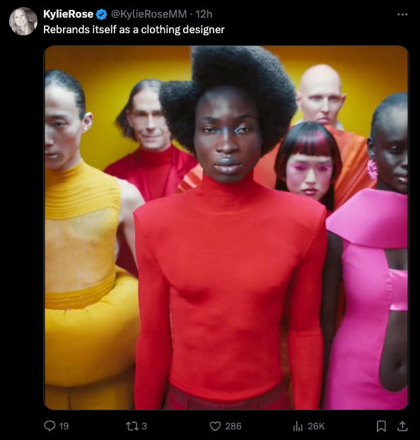
Many users were clearly confused by the new branding and likened it to a design motif of a fashion brand.
This backlash serves as a reminder that while modernizing a brand is important, it should never come at the expense of what makes it unique and memorable.
What This Means for Jaguar
Logos are more than just design elements—they’re strategic assets that drive recognition, loyalty, and sales. Jaguar’s decision to abandon its iconic logo in favor of a minimalist redesign risks alienating long-time fans while failing to resonate with new customers.
In a world where visual identity is a brand’s first impression, Jaguar has traded its distinctiveness and heritage for a trend that may not age well. And for a luxury automaker, this is an unforced error that could cost the brand dearly.
Jaguar’s rebranding decision might look sleek on the surface, but it comes at the cost of its heritage and emotional resonance, and clearly something that its ardent fans are not pleased with, as it takes away everything that made them fall in love with the cars in the first place.
By prioritizing trends over timeless identity, the brand risks fading into the sea of minimalism rather than standing out as a beacon of luxury and performance. For a name as iconic as Jaguar, it’s a missed opportunity, it’s a step in the wrong direction.
Will Jaguar make a uturn? or embrace it’s new direction off a cliff and end up in the scrap heap?